Why brands are embracing the ‘graphic design is my passion’ look
Nutter Butter and Surreal cereal are among the brands leaning into intentionally bad social design as a creative strategy.
Marketing Brew
• 4 min read
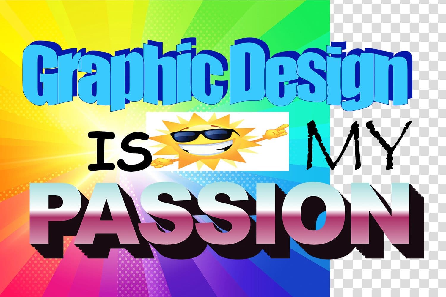
Remember the “graphic design is my passion” meme? It’s been nearly a decade since the original image, featuring a red Papyrus font and a clip-art image of a frog, first started circulating as a tongue-in-cheek way to respond to less-inspired design choices. Now, it seems to be serving as a source of marketing inspiration.
Brands like Nutter Butter, Sour Patch Kids, and Wendy’s are posting grainy, “deep-fried” memes steeped in internet humor. Bottles of Kyse Perfumes, which retail for $85, feature Papyrus and Comic Sans-like fonts on the packaging. NPR’s Planet Money has become known for its low-tech graphics on Instagram and TikTok. And Surreal Cereal put out typo-filled billboards earlier this year that look as if they were made with Microsoft WordArt.
“It’s interesting to see this starting to emerge within advertising 10 years later, but there’s still that cultural relevance,” Sam Houle, creative director at brand experience firm Siegel+Gale, told us.
Back to basics
Aubrey Burrough, a social media strategist at Dentsu Creative who works on Nutter Butter, said it’s now “becoming more commonplace for brands to start experimenting” with the form. Blake Pleasant, an art director and content creator at Dentsu Creative who has worked on social posts for the same account, considers the rise of the deep-fried brand post as a natural reaction to the ultra-polished looks that once dominated the internet.
“We see it as almost like a response to the overly curated Instagram aesthetic,” Pleasant told us. “We just feel like perfect curation feels fake, so we’ve moved beyond that, culturally, as Nutter Butter.”
Many of Nutter Butter’s social posts, which are geared toward Gen Z, can appear low-effort or inexplicable on their own, but they require more work than meets the eye. One post, which Pleasant described as a “cursed dollhouse” and which recently performed well on Instagram and TikTok, took him a week to create.
The creative effort has paid off in engagement and loyalty, they said. According to Burrough, Nutter Butter has more than doubled its Instagram followers in the last year and curated what she described as a cult-like following complete with inside jokes about everything from a vintage Nutter Butter ad to a superfan named Aidan.
Get marketing news you'll actually want to read
Marketing Brew informs marketing pros of the latest on brand strategy, social media, and ad tech via our weekday newsletter, virtual events, marketing conferences, and digital guides.
By subscribing, you accept our Terms & Privacy Policy.
"It’s just become this very absurd, strange community who is leaning into this big inside joke that doesn’t really make any sense,” Burrough said.
Low-effort look, high-effort reward
While that vibe may sometimes be directed toward Gen Z, there can be more widespread appeal. Houle said the trend may also appeal to the generation that first made graphic-design memes popular in the 2010s.
“I do think it can stretch into that younger spectrum of millennials, who are potentially holding those roles or having that strong voice in the room for approvals,” they said. “I remember sitting in my school computer lab and working in Microsoft Paint, making things just like this.”
Beyond absurdism and nostalgia, seemingly low-effort design could also resonate because of its relatability with the people behind the art. John Thornton, senior creative at Surreal cereal, told us the brand’s New Year campaign with WordArt-inspired billboards was borne from the idea of putting in the bare minimum at work after the holidays. An Instagram post from the brand also cites a general lack of energy in the winter and the desire to “be in bed watching movies” as inspo.
“Emotionally speaking, no one can be arsed, and so saying that, everyone’s like, ‘That’s me right now,’” Thornton said.
For Surreal’s work, Thornton said he focuses on making a design look “lazy,” not just bad: The desired effect is achieved through white backgrounds and “fonts that someone who doesn’t work in marketing or an office job” could name, like Comic Sans or Arial.
Part of what has helped these campaigns work for the brand is that “not everyone likes it, but it’s not offensive,” he said, which sparks just the right amount (and tone) of discourse.
Knowing that intentionally bad design is a tried-and-true method for engagement has also worked in Thornton’s favor as a creative when he’s in need of ideas. “I see it as a ‘break glass in case of emergencies’ kind of thing,” he said. “I highly doubt this is the last time I will resort to it.”
Deep-fried memes, like deep-fried food, can also be extremely satisfying: “As a creative who has worked on brands that don’t have this type of approach, it’s super cathartic, and it’s inspiring,” Pleasant said.
About the author
Katie Hicks
Katie Hicks is a senior reporter for Marketing Brew covering culture and social media. She also co-hosts the Webby Award–winning podcast “Marketing Brew Weekly.”
Get marketing news you'll actually want to read
Marketing Brew informs marketing pros of the latest on brand strategy, social media, and ad tech via our weekday newsletter, virtual events, marketing conferences, and digital guides.
By subscribing, you accept our Terms & Privacy Policy.