The best and worst rebrands of 2023, according to experts
Barbie's brand revitalization wowed, while Max and X left something to be desired.
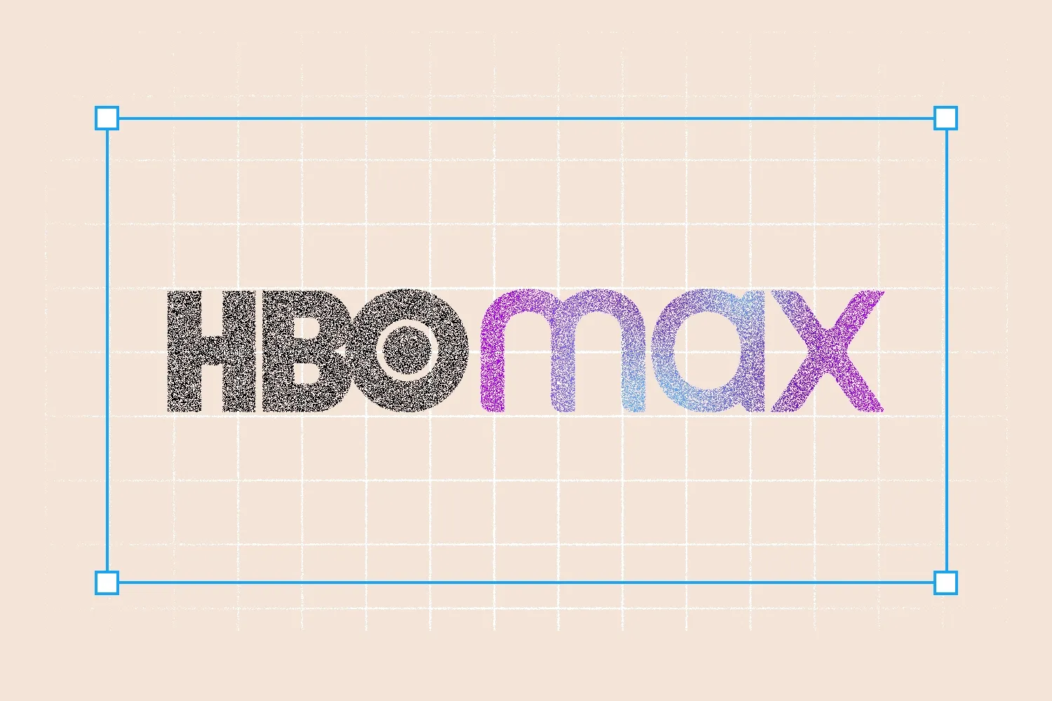
Illustration: Francis Scialabba, Images: Max, X, Johnson & Johnson
• 4 min read
As we pack away our Halloween costumes and Mariah Carey defrosts to usher in the holiday season, we here at Marketing Brew are taking a look at the best and worst rebrands of the year.
While this year saw some questionable rebrands (here’s looking at you, X) marketers and brand experts we spoke to pointed out some others that deserve our attention, for better or worse.
Responses have been lightly edited and condensed for clarity.
The winners
Barbie’s brand makeover
“It was a brand that had sort of fallen out of culture, sort of had a bad rap, and was losing market share. Then, through this movie [and] through the multichannel and omnichannel activations, they were really able to enter into the cultural zeitgeist, change the conversation, reposition themselves, and reimagine Barbie moving forward, which was pretty amazing. They acknowledged all of the challenges the brand came with and also painted a picture of how they’re moving forward with all the diversity that you saw in the movie, which was more of a real reflection of where society and culture is today. I think it was, hands down, the branding moment of the year.”—Hillel Hurwitz, CEO and founder of creative shop Bald
EA Sports’s FIFA franchise successor, EA Sports FC
“I wish I had worked on that. FIFA has been around for so long. It’s such a staple in the world of soccer. It creates the connection between the real world and the gaming experience…The solution was pretty cool. EA Sports FC, the energy of the new identity, and the logo with the triangle. It’s sports, it’s sharp, it’s high energy. It’s connected to the user experience of the video game itself. I thought it was a really smart solution.”—Ramon Jimenez, global principal at brand consultancy Wolff Olins
Eurostar’s railway rebrand
“They’ve captured travel and Europe really, really nicely…It’s got an idea at the heart of it, this spark that holds the whole identity together. But then that spark also becomes the logo and the E. I think the way that it goes through the whole system is really nice…The typeface feels really unusual for a brand. And Eurostar, it’s such a great service, but it’s felt so tired and dusty for so long. It’s just so nice to kind of see it get a new lease of life.”—Sean Thomas, ECD at global agency Jones Knowles Ritchie
The losers
HBO Max’s rebrand to Max
“I don’t understand why you would walk away from all the equity that exists from years of amazing content that has been linked to that brand. [HBO] has such an amazing reputation for storytelling and great TV from The Sopranos, Sex and the City, Game of Thrones, and so many other franchises. That’s equity that has been transferred to HBO, and then all of a sudden you walk away from it?...I feel like that one could’ve used a little bit more thoughtfulness.”—Ramon Jimenez, global principal at brand consultancy Wolff Olins
Get marketing news you'll actually want to read
Marketing Brew informs marketing pros of the latest on brand strategy, social media, and ad tech via our weekday newsletter, virtual events, marketing conferences, and digital guides.
By subscribing, you accept our Terms & Privacy Policy.
“HBO had such brand equity. Home Box Office is such a good name [and] a perfect encapsulation of what the value of HBO is. They had kind of started that whole ‘golden age of television’ thing. Instead of building on that further, and maybe taking that into its next era, they kind of just threw it all away.”—Jeffrey Kotran, VP of brand strategy at Altitude Marketing
Twitter’s much-publicized switch to X
“I know everyone’s going to say it, but it does deserve an absolute dunking-on, if I’m honest. I love Twitter, and I used it for years…When you’re on the homepage, the logo is black and white, but all the UX and UI is blue. People still say ‘I’m tweeting things’ rather than ‘I’m X’ing things.’…I just think it’s a shame. You’ve thrown away loads of distinctive assets. You’ve thrown away a platform that was really good. You go on there now, and it’s just disinformation. It’s fake news.”—Sean Thomas, ECD at global agency Jones Knowles Ritchie
Johnson & Johnson’s new visual identity
“You see a brand that has such a legacy, and has such a story behind it, [and you] water down any bit of personality, going from that script to a very minimalist, almost boring typography. It’s stripped away a lot of the personality and the legacy that the brand came with. You see that happening a lot. I think a lot of brands are moving toward this sense of minimalism, ‘let’s strip everything down, keep things super basic, and make it more digital.’”—Hillel Hurwitz, CEO and founder of creative shop Bald
About the author
Jasmine Sheena
Jasmine Sheena is a reporter for Marketing Brew writing about adtech, Big Tech, and streaming.
Get marketing news you'll actually want to read
Marketing Brew informs marketing pros of the latest on brand strategy, social media, and ad tech via our weekday newsletter, virtual events, marketing conferences, and digital guides.
By subscribing, you accept our Terms & Privacy Policy.